I designed the shapes for use in product & marketing. I also had a key role in the typeface, illustrations and colour palette.
- 2021
- BRAND IDENTITY
- DESIGN SYSTEM
- ILLUSTRATION
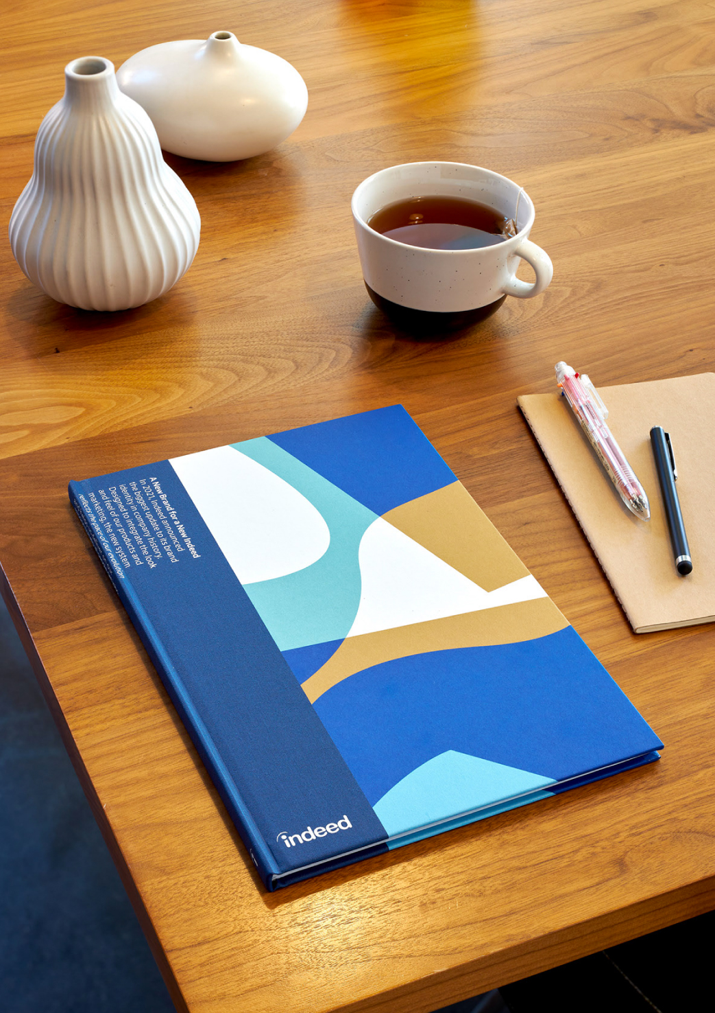
Indeed undertook a company rebrand during 2021/2022. During the time of the rebrand process, the world was changing before our eyes. Covid had resulted in lockdowns, Black Lives Matter was leading a transformation in the US and globally. It felt like we were entering into a new world, permanently. Indeed's old brand felt cold and too digital for this new world. We wanted Indeed to feel more human for our users.
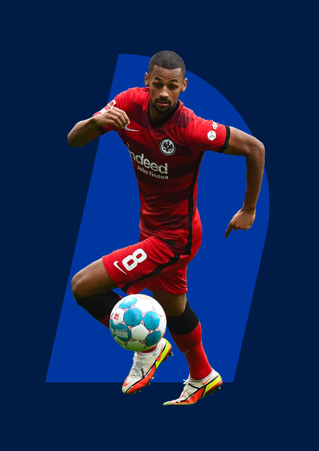
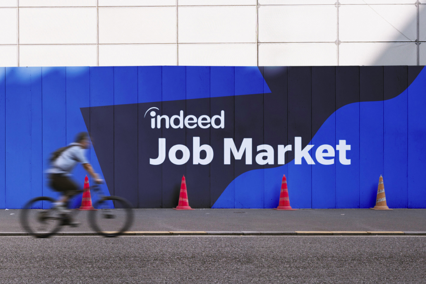
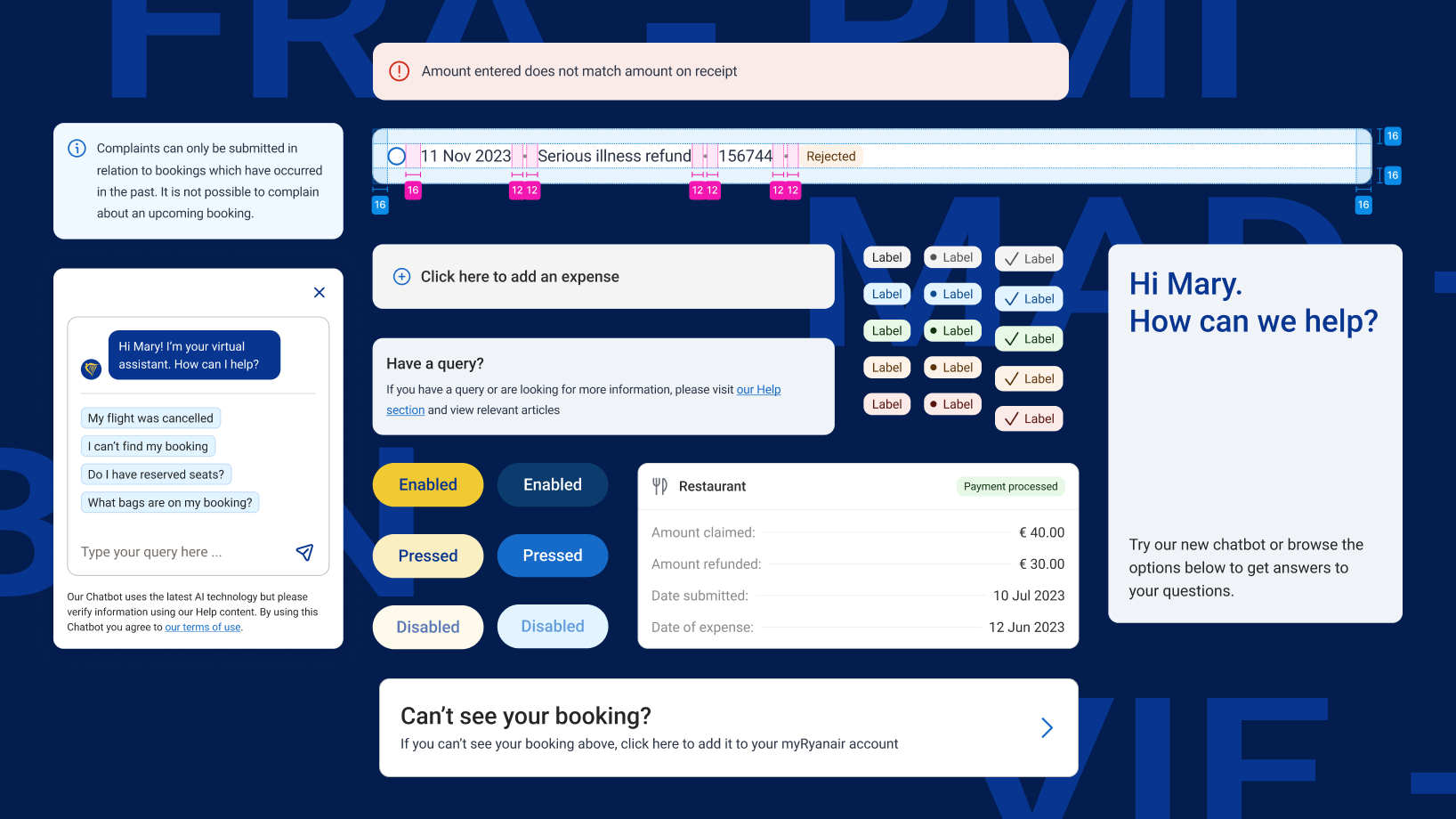
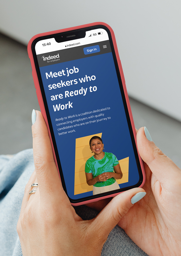
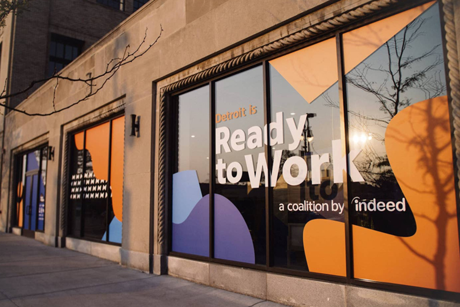
The shapes work well for product, in combination with illustrations, as simple backgrounds, and in motion. They're used across product and marketing - In Indeed's app, on landing pages, in social assets, print ads, OOH etc.


INSPIRATION
While ideating for our shape language, I explored options that felt more human. I wanted to design something simple that felt as if it was cut by hand. I worked closely with our illustrator and Product team to create a shape library that would work well for all applications. I created guidance for other designers to follow, and provided direction to internal designers to build out our brand asset libraries.